Portfolio
/Project 02
Welcome to my personal website! Every part of this site—from the design to the coding—was created by me. As you’ve been scrolling through, you’ve actually been exploring one of my best works!
Like any other brand, I needed a logo, a website, and engaging content. So, I built everything from scratch, and I’m proud of the effort and dedication I put into it. Now, I’d love to share the journey I went through while creating this website.
My initial plan was simply to build a website and use my name as the logo. However, as I got deeper into the process, inspiration struck, and I found myself coming up with a logo idea. I hadn’t even considered creating one at first, but my excitement for the project naturally led me in that direction.
Logo
As I mentioned earlier, my initial idea was to use my own name as a logo. Then, I decided to give it more personality by handwriting it. My handwriting is a mix of order and a little bit of messiness, which I felt reflected my style well. The logo naturally took shape as I experimented with different variations, refining it with each attempt.
As I examined the option on the right, I noticed an interesting resemblance. I had only used the letters “i” and “r,” but something about their form stood out. I refined the design to make it more aesthetic and added a final touch—lines under the letter “r” that resemble both a swan’s wing and the letter “m,” the last letter of my name.
And that’s how I arrived at the final version of my logo. A simple idea evolved into something unique, reflecting both my name and a touch of creativity.
The Process of Website Design
01. Information Architecture
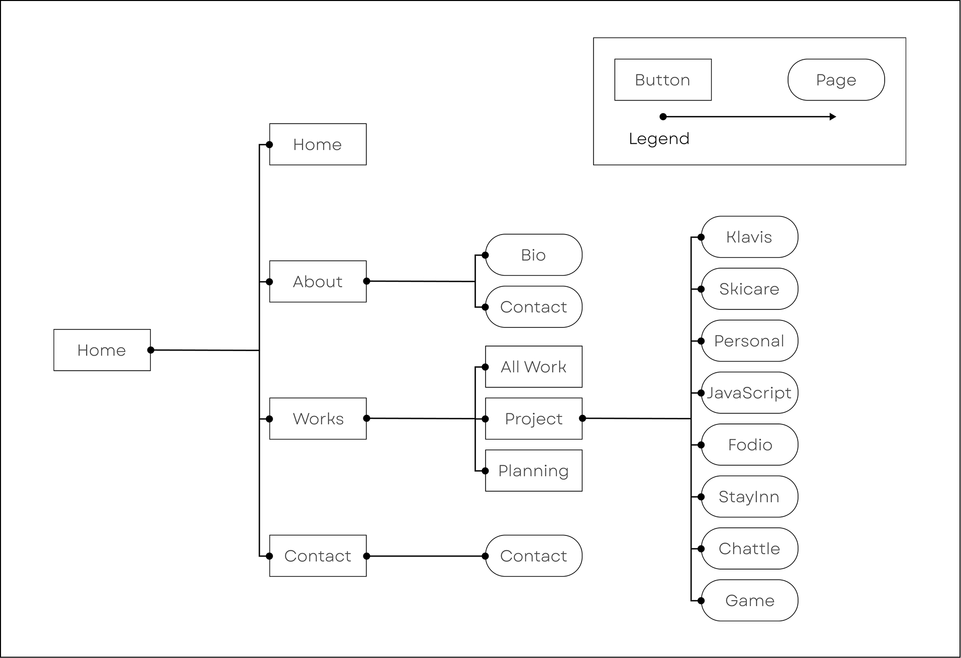
I started my project by researching how other portfolio websites are built. Once I gathered insights and summarized my ideas, I decided to create a straightforward and intuitive site map to keep things simple and effective.
02. Grids & Wirframes
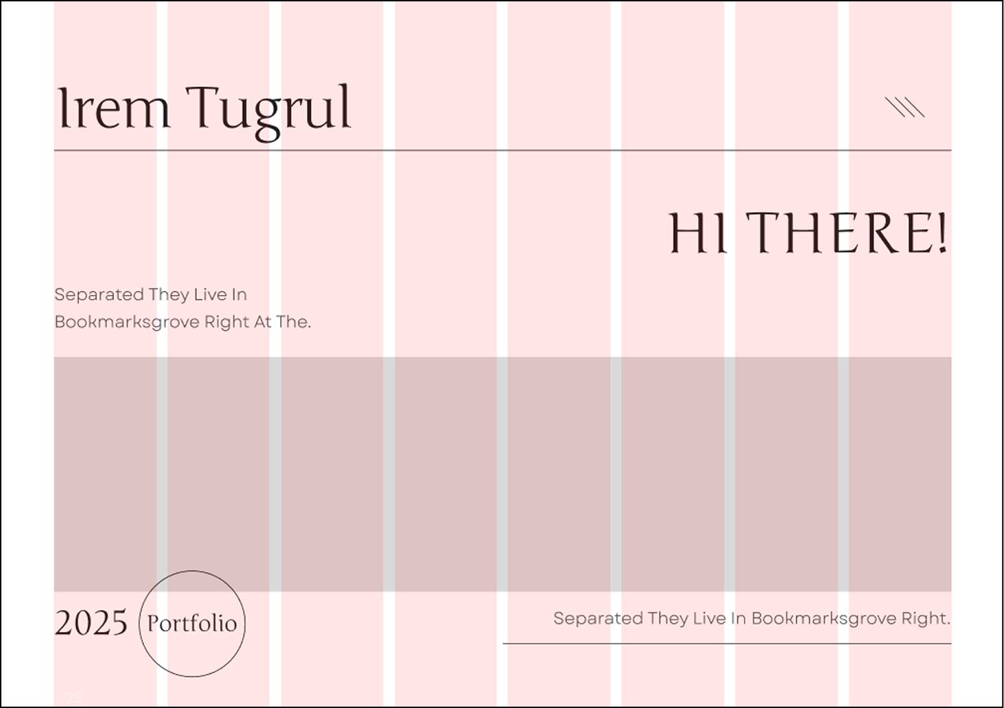
I wanted to use a more flexible and responsive grid—a soft grid—to ensure a balanced layout. This grid system became the foundation of my design, maintaining consistency throughout the entire website.
Here’s how my wireframes turned out. Before reaching this stage, I explored 3-4 different layout options for each section of the homepage and its linked pages. The final design may differ slightly from these wireframes because I wanted each page to have its own unique identity while maintaining a cohesive structure.
03. Typography & Colors

The main ambiance I wanted for my website was a newspaper-inspired look. This is why I chose serif fonts for the headings, giving them a classic, editorial feel. The buttons, with black borders and no extra styling, gain their strength from simplicity, complementing the overall newspaper aesthetic. For the color scheme, I stuck to black and white to maintain that magazine/newspaper vibe.
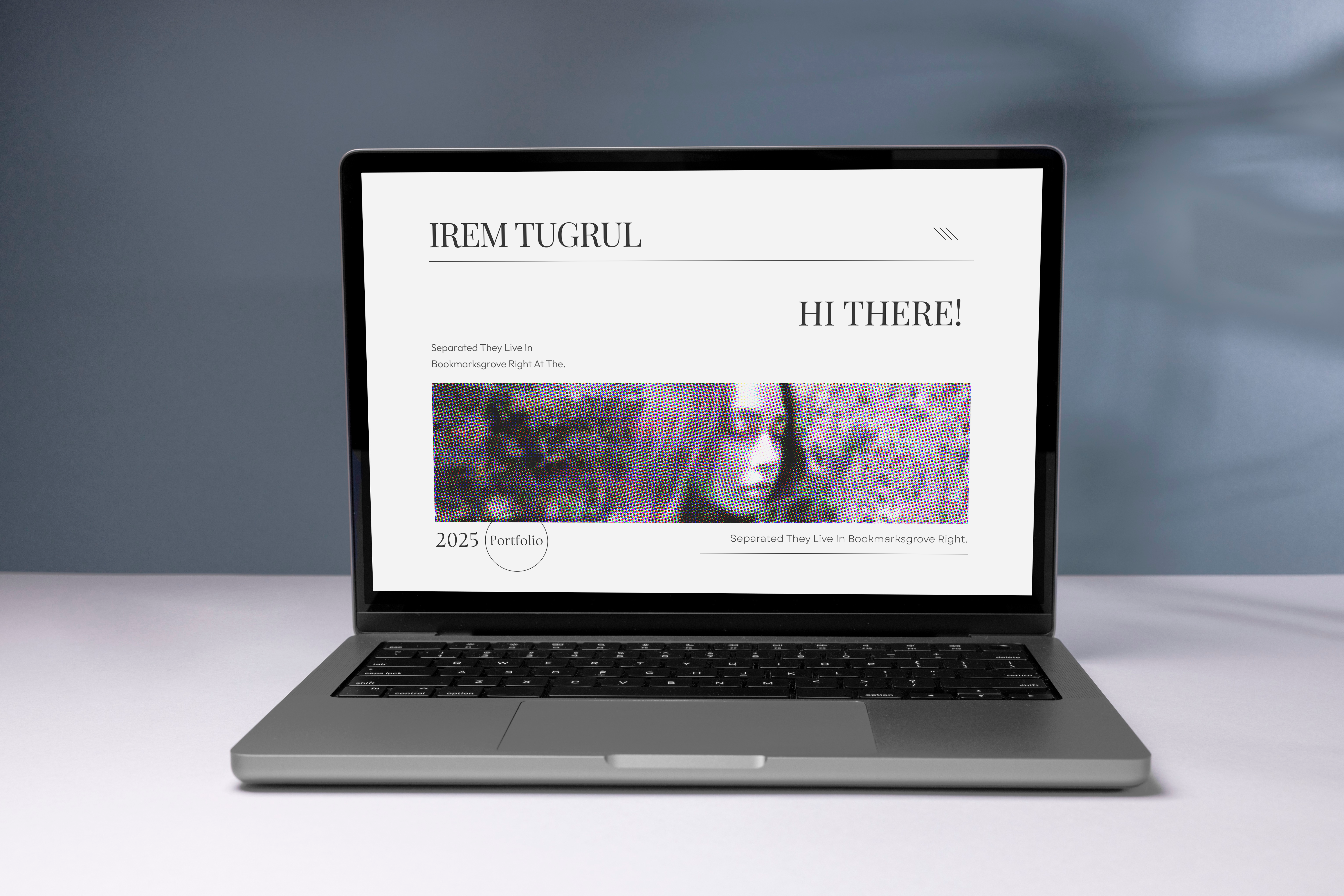
04. Final Design