Klavis
/Project 01
Klavis is a case study project that I created from scratch. In the beginning, there was no defined brand, so I developed everything from the name to the final product.
For the name, I looked up the Latin translations of a few words and chose "Klavis," which means "key." I picked this word because I wanted it to be meaningful and convey the idea that "the key to success is studying." Once the name was decided, it was time for the core step of any brand design—the logo.
LOGO
The first thing I did was sketch a key shape. Then, I began thinking about what to combine it with. To find the right element, I researched symbols that represent wisdom.
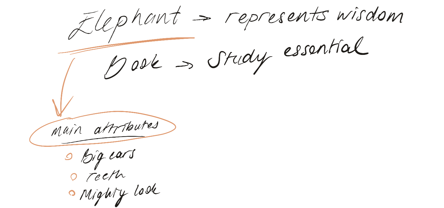
The elephant was the perfect choice for this project. I listed its most recognizable features and tried to incorporate them into the design. My first idea was a combination of an elephant and a key, but it didn’t quite achieve the look I was aiming for. So, I decided to digitize the logo and refine it from there.
In Illustrator, I explored several possible versions. While working on them, I realized something was missing—I needed an element that stood out and symbolized studying: a book. From left to right, you can see the logo's evolution.

I was satisfied with the final logo and decided to conclude that part of the process. From there, I moved on to the second phase—the website.
WEBSITE
The website design process was exciting! First, I gathered all the essential information about the brand—Who are they? Who is their target audience? What do users expect from the app? What solutions does it offer?
Now, I’ll be sharing the entire process along with some images from the project.
The Process of Website Design
01. Research & Analysis
The first step is to understand the brand you're working with and their target audience. To do this, I prepared a set of questions about the brand and analyzed the answers. This step helps me work systematically by gathering all the essential information in one place.
02. Persona Cards
After the project brief, I created personas based on the research findings and summarized the key expectations users have from a study app.
03. Information Architecture
04. Grids & Wireframes
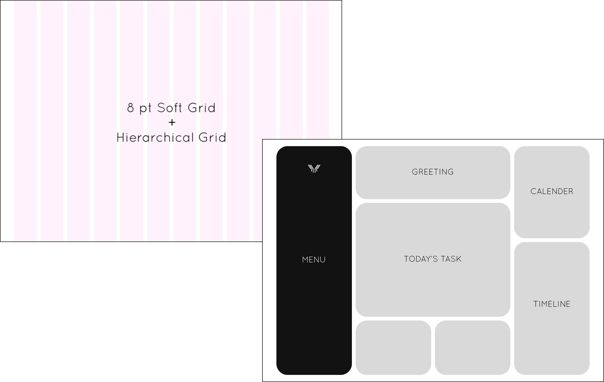
Using soft column grids, I created a hierarchical grid for the wireframe. The reason behind this decision was to ensure that students could easily access everything they need without navigating between pages, which could disrupt their focus.
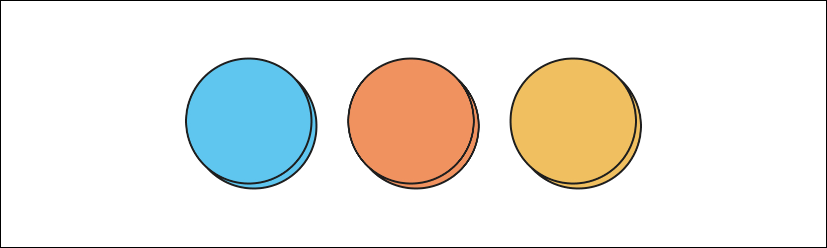
05. Typography, Colors & Assets

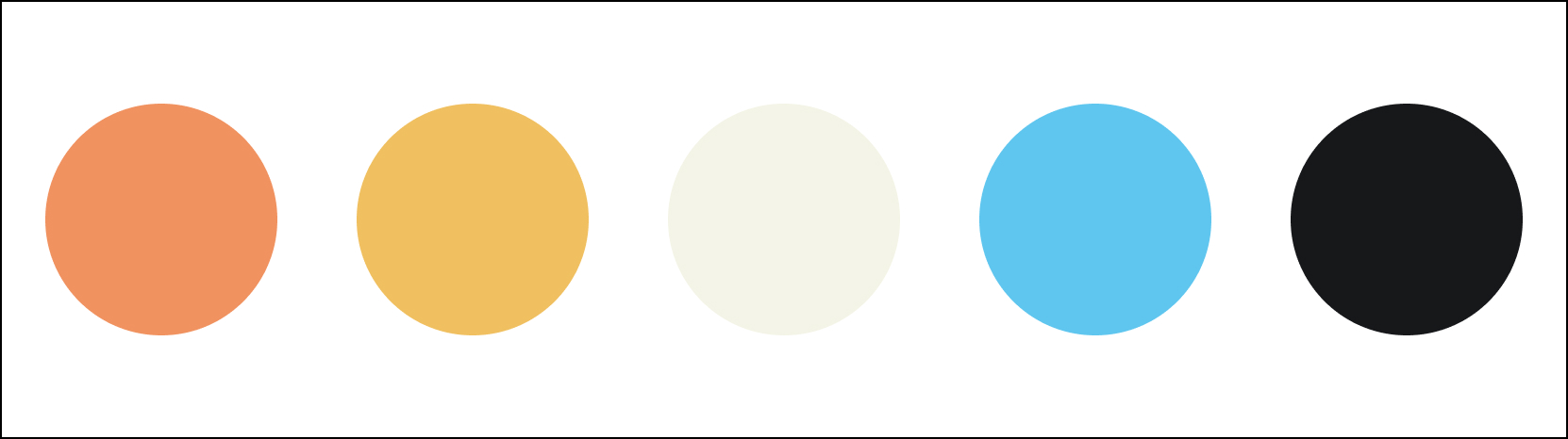


My goal was to create a study app that had a game-like feel. To establish a calming vibe, I chose blue as the primary color. At the same time, I wanted to evoke adrenaline in certain moments to keep students engaged.
Building on the color scheme, I designed the buttons inspired by retro game consoles. Since the goal was to create a fun atmosphere, I also developed illustrations with a slightly cartoonish style.
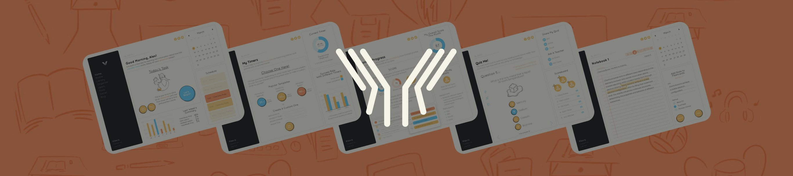
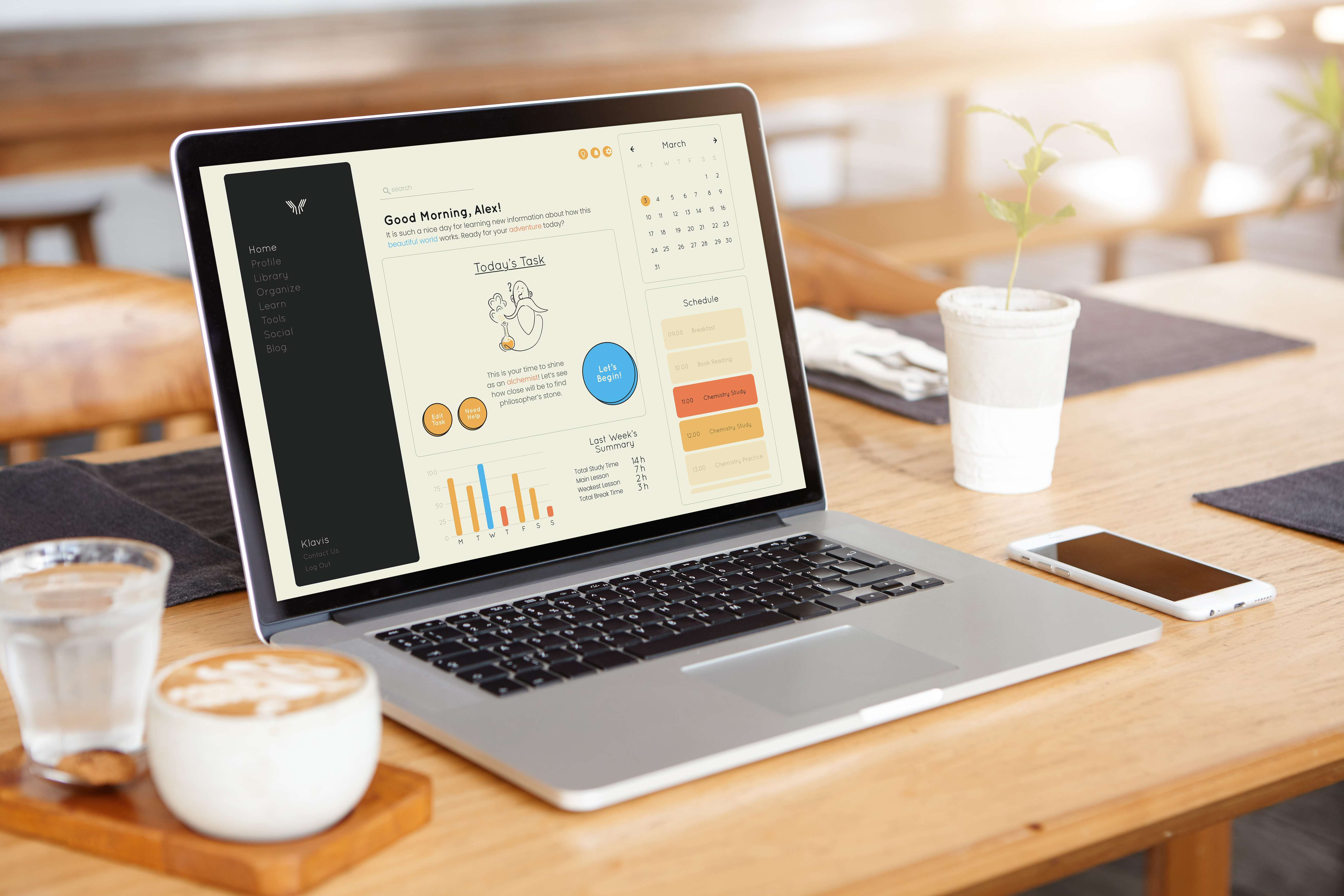
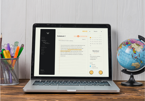
06. Final Design
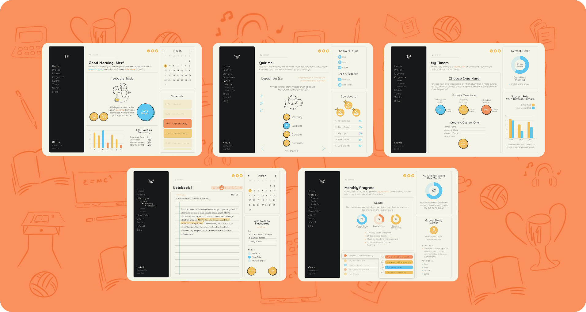
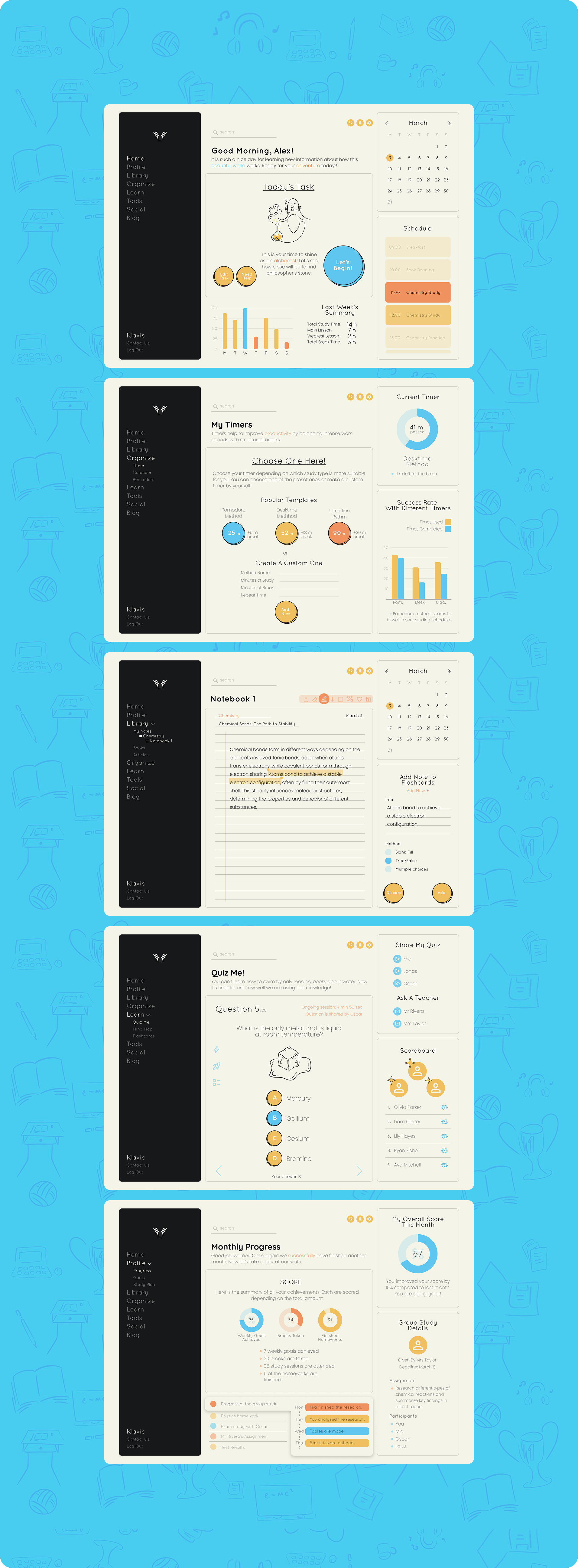
Homepage: Where you can view all your daily assignments in one place.
Timers: In this section, you can choose from pre-set timers or create your own. It also tracks which timers help you work most effectively.
Notebook: Here, you can take notes and easily share them with friends and teachers.
Quiz: This section allows you to test yourself using the notes you’ve taken in your notebook.
Profile: A place where you can track your daily, weekly, and monthly progress, see your current assignments, and view who you’re working with.
The final design of the website includes several key sections:
SOCIAL MEDIA POSTS
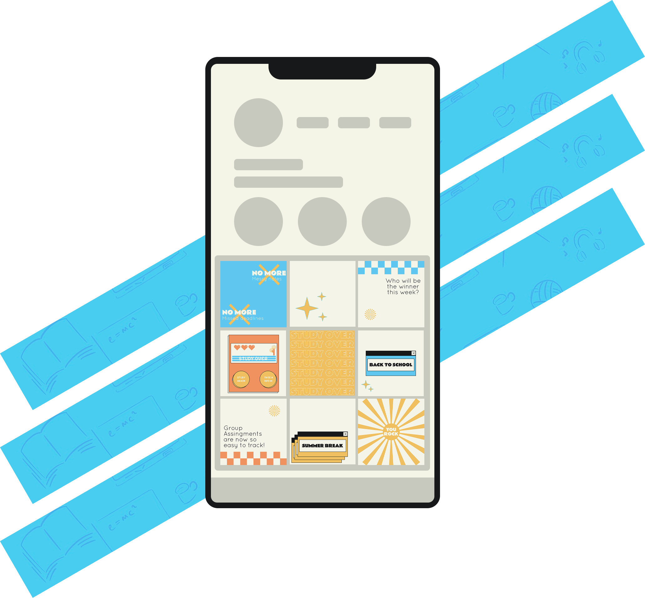
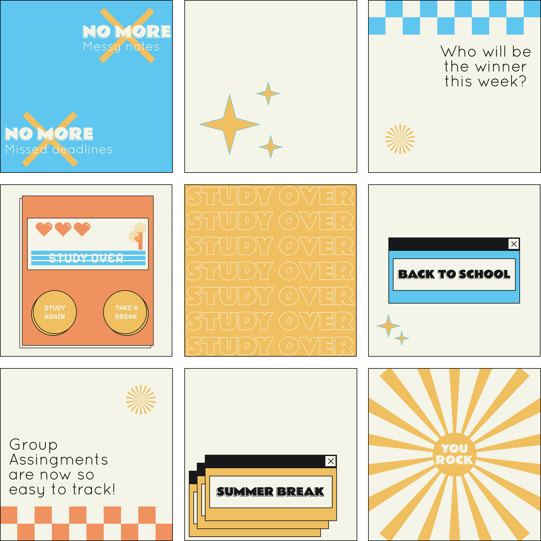
Last but not least, I designed some social media posts for them, focusing on capturing the retro game vibe.